Tools, Lineart, Shading skin
*** Part 1 ***
Whai hullo thar. So uh. I've noticed that there aren't, like, a great deal of tutorials out there for Paint Tool SAI. Seeing as the program's rapidly gaining popularity, I thought I'd put some of my techniques out there for people who opened SAI for the first time and said «whut?» There's a link to download SAI in my description if you've never used it before and decide that you want to give it a try. It's a magnificent program and I recommend giving it a go Okay, blah blah blah, let's actually draw some stuff!
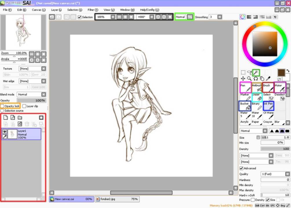
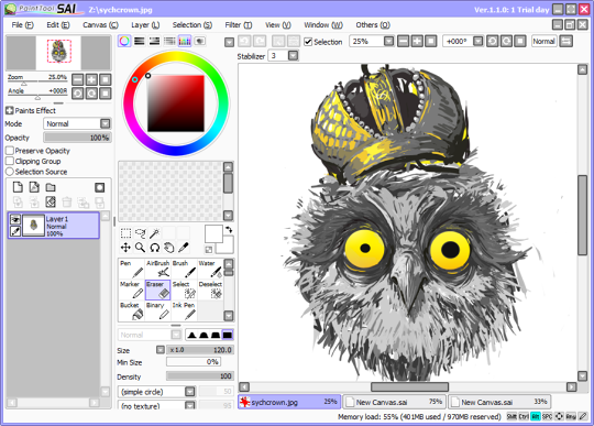
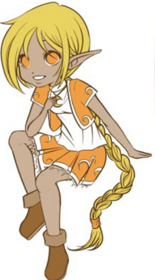
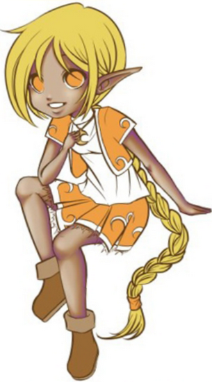
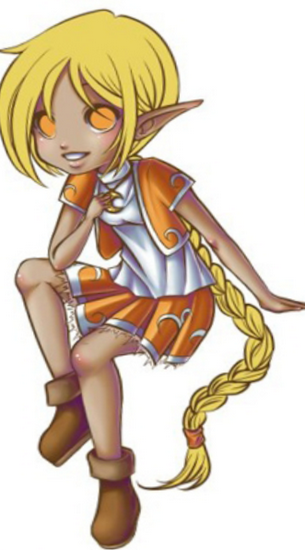
Everyone say - HI- HIEKE! This is my little girl Hieke; I haven't drawn her in a long time, so I pulled her out of the depths of my mind to enlist her aid in this tutorial. As you can see, the sketch isn't quite finished yet. This is, however, and excellent time to acquaint you with the tools I'll be using throughout the course of the tutorial. (The color of the text matches the color in which the tool is highlighted.)
Layers menu: Layers work just like they do in any other program. Very handy things.
Opacity lock: Otherwise known as transparency lock. With this enabled, you can't color anywhere where there aren't already pixels. This function is actually really hard to explain, so just., try it if you don’t already know.
Zoom and rotate: Linearfs best friends. Zoom is self-explanatory Rotate is an incredibly useful tool that lets you, well... rotate the picture, of course. By pressing the square, you can reset the picture to its original angle.
Invert: Flips your picture horizontally. Great for getting diagonals that you just can’t get without, like, rotating the picture completely upside down.
Ink Pen: It's like the normal pen tool, but it goes to much smaller sizes. With it you can make very light sketches easily, and by bumping up the size you can make nice, smooth linear!
Pen tool: I'd say this is the equivalent to the paintbrush in Photoshop. It yields crisp lines and is very responsive to pen pressure, so it's useful for doing base colors. It's not the best choice for lineart; I find that it can be a bit bumpy.
Brush: Hmm. .. It's more of a smudge tool than anything else. If you give it some pressure, it'll put down color; you can then smudge that color around with light pen strokes. It's ideal for blending.
Airbrush: The airbrush is just like it'’s always been.
Magic wand tool: Same magic wand tool as always.
Eraser: I hope you know what this does.
Bucket: AKA fill tool.
Water tool: It's kind of like blur, but I find that it's more gentle and pleasant to use. Instead of rubbing furiously with blur. I just dab water a few times and it smooths nicely.
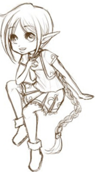
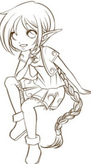
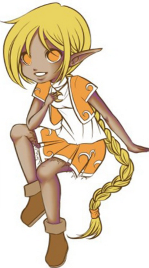
Here we have the finished sketch that I'll be working on. I may be using a chibi, but it's a soft shading technique that'll look nice with any style of drawing.
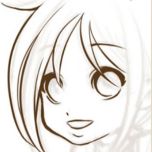
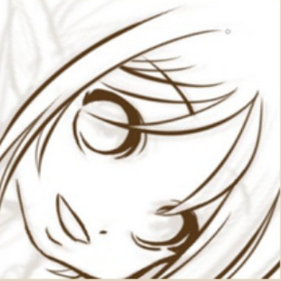
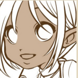
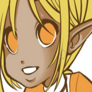
Starting with the lineart now on a new layer above my nearly-transparent sketch. I always do the eyes first, then the side of the face, and then the hair. I don't really know why. These locks of hair are easy to do because I can swoop my wrist in that direction with little effort But those strands to the right are gonna give me some trouble!
...Or ARE they? Yay for invert and rotate! Never again will you have to break your wrist to finish lineart!
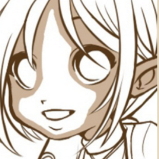
⟵ ⟵ ⟵ ⟵ Rotating and inverting every now and then, I've finished the lineart. I like to keep it brown because it's nice and soft. In the end I can color the lineart if l want by locking the layer opacity and scribbling color over it, but I won't be doing that this time.
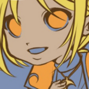
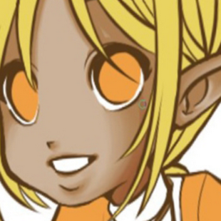
A new layer under the lineart now, I use a different layer for almost every element of the character (one for skin, one for hair, one for orange things, one for her necklace, etc.) Instead of carefully coloring in everything, I just go around the penmeter and use the magic wand, making sure to round off comers so the selection doesn't miss those pointy bits that it tends to miss.
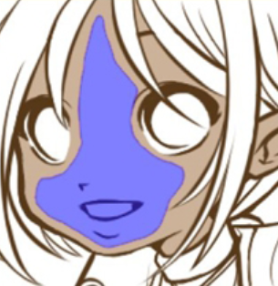
Ew, what's with that blue color?! Fear not, that's just what SAI's way of saying "this is the area you have selected". When I click another tool, such as the fill bucket..
.. the ugly blue turns into marching ants! Did you know that that's the term for those blinking gray dots? And from there, it's just one click of the fill bucket from being perfectly filled in. Easy! I do this for the entire picture, putting each base color on a different layer like I mentioned earlier. But when I get to coloring in the white parts, I run into a problem.. The picture's on a white background! I guess I could blindly throw color at it and see where I hit and miss when it comes to shading, but...
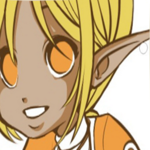
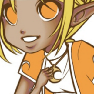
This is the better (and more obvious) solution. I make a new layer below all the others and All it with a dull color like purple-gray or purple-gray. I don't use brown because there's so much orange, and brown wouldn't provide a great deal of contrast. Some people work with this contrast layer on the picture through the whole process, but I find that l actually tend to make MORE mistakes when using a contrast layer. So I only use one when I have to.
For the actual shading, it starts out cel-shaded. I go through shading all of the skin with the pen tool in with a single color. I'm working directly on the base color layer with the opacity locked; this way there's no erasing to do after. Kind of bland, huh? I'm not a big fan of cel-shading, even with chibis.
..so next l take the brush tool and begin to stroke at the edges of the shadows I go back and forth until it's as smooth as I want it to be. Don't forget about those invert and rotate tools! Awkward angles become as natural as any other with these tools, so make use of them. Here I've finished smoothing all the shading. Next I'm going to start deepening the shadows and giving the skin some depth.
Instead of cel-shading and smoothing like I did before, I get right in there with the brush tool and save myself a step. It can get kind of hard-edged of its own will, so I'm constantly blending from all kinds of directions. (And you'll discover in using SAI that when it comes to the brush tool, the direction really does matter!)
Purple just adds a whole new level of depth to shadows. I think. I love how rich it looks.
At this point I've got the purple applied to the whole picture. The shading for the skin is essentially done; now ifs time for highlights.
I start by airbrushing some lighter color onto the cheeks and knees and arms and such. After, I add reflected light. (This step isn't shown in this picture.) I take the base color and go along the edge of the darker shadows, then use the water brush at a small size to soften it down.
Then I airbrush some pink onto it - well, pink on the face and more reddish on the knees and elbows + and add in hard white highlights. I do the clothing the same way as I did the skin, save for the white highlights. I don't really like white dot highlights on clothing, unless it's something reflective like spandex or something. So the next parts are just progression notes.
I go about shading the hair and eyes in a similar manner, but it's a bit different from what I've done up to now. I'll describe my technique with shading the hair and eyes in the next part, because this tutorial is already a bit long. And by "a bit", I mean "so big that it's about to crash Photoshop". There's a link to the next part in the description, so I'll see you there!